Color plays a bigger role in commercial interiors than most businesses realize. Beyond aesthetics, the colors you choose influence how people feel, how long they stay, how productive they are, and how your brand is perceived. In offices, healthcare facilities, retail spaces, and industrial environments, the wrong color can feel distracting or dated, while the right one quietly supports focus, comfort, and professionalism.
As we move into 2026, commercial color trends are shifting away from extremes. Loud statements and overly stark palettes are giving way to calmer, more intentional color systems that balance warmth, durability, and long-term appeal. These colors are designed to age well, work across large spaces, and pair easily with modern materials like metal, glass, wood, and concrete.
Below are five of the best interior colors for commercial spaces in 2026, along with guidance on where they work best and what they blend well with.
2026 Commercial Color Pairing Guide
| Primary Color | Best Pairing Colors | Overall Effect |
| Warm Greige | Soft white, muted blue, natural wood | Clean, flexible, welcoming |
| Soft Blue-Gray | White, light wood, charcoal | Calm, professional, focused |
| Muted Green | Greige, cream, black accents | Restorative, balanced |
| Warm Taupe | Deep blue, ivory, bronze | Refined, timeless |
| Charcoal (Accent) | Greige, white, wood tones | Structured, modern |
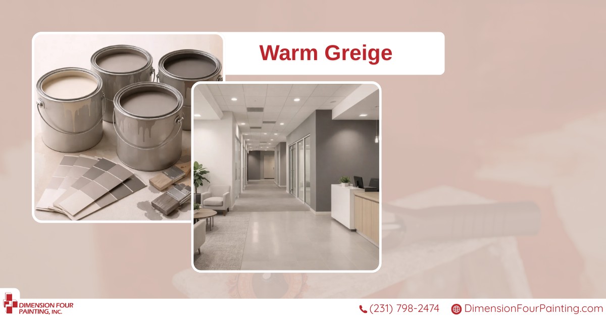
1. Warm Greige (Balanced Neutral)
Warm greige continues to dominate commercial interiors, and for good reason. Sitting between gray and beige, this color offers neutrality without feeling cold or sterile. It provides a clean backdrop that works across offices, healthcare spaces, and public-facing interiors.
Greige performs especially well in spaces where flexibility matters. It adapts easily to changing furniture, branding updates, and lighting conditions. Unlike cooler grays, it feels welcoming rather than institutional.
Blends well with:
- Natural wood tones
- Black or dark bronze metal accents
- Soft whites and off-whites
- Muted blues or greens as accent colors
Best used in:
Offices, conference rooms, corridors, reception areas, administrative spaces
2. Soft Blue-Gray (Calm and Professional)
Blue-grays are becoming a go-to choice for businesses that want a calming environment without sacrificing professionalism. This color supports focus and reduces visual noise, making it ideal for environments where people need to think clearly or feel at ease.
In healthcare and office settings, soft blue-grays help reduce stress while still feeling clean and modern. They also reflect light well, which helps brighten interior spaces without glare.
Blends well with:
- Crisp white trim
- Light wood finishes
- Brushed nickel or stainless steel
- Charcoal or slate accents
Best used in:
Healthcare facilities, offices, meeting rooms, waiting areas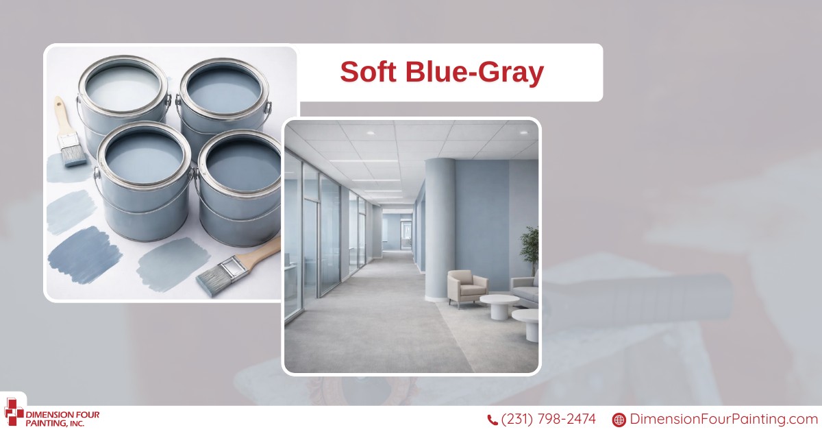
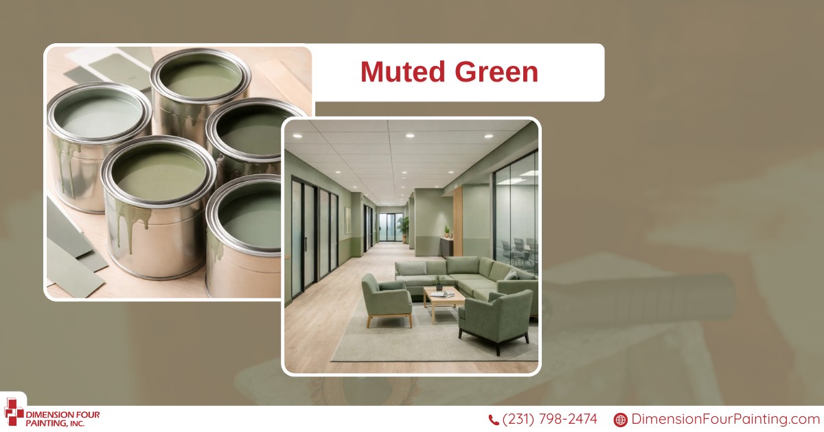
3. Muted Green (Grounded and Restorative)
Muted greens (especially sage and eucalyptus tones) are gaining traction in commercial interiors because they feel restorative without being distracting. These colors subtly reference nature, which helps improve comfort and focus in indoor environments.
Unlike bold greens, muted versions stay professional and versatile. They also work well in larger spaces without overwhelming the eye, making them suitable for corridors and shared areas.
Blends well with:
- Warm neutrals like greige or beige
- Light oak or maple wood
- Matte black accents
- Soft cream or off-white trim
Best used in:
Healthcare spaces, offices, employee break areas, wellness-focused environments
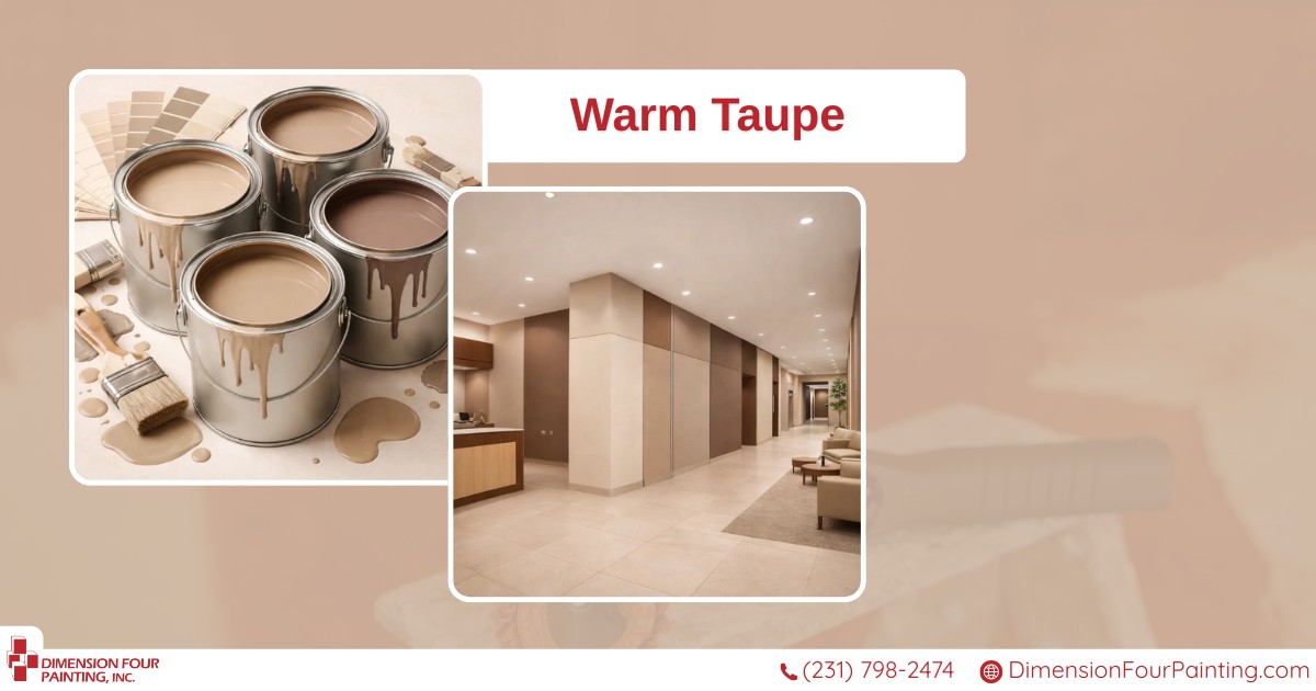
4. Warm Taupe (Refined and Timeless)
Warm taupe is making a strong return in commercial spaces where longevity and sophistication matter. This color adds depth without feeling heavy and works particularly well in environments that want to feel established and trustworthy.
Taupe is a smart alternative to darker browns or outdated beiges. It creates warmth while maintaining a professional tone that doesn’t date quickly.
Blends well with:
- Deep blues or greens for contrast
- Brushed brass or bronze hardware
- Dark wood furniture
- Cream or ivory accents
Best used in:
Professional offices, law firms, financial institutions, executive spaces
5. Charcoal Accent (Controlled Contrast)
Rather than covering entire rooms, charcoal is best used as an accent color in 2026. When applied strategically, it adds contrast, improves wayfinding, and reinforces brand identity without darkening the space.
Charcoal works especially well on feature walls, behind reception desks, or in conference rooms where visual structure matters. Used sparingly, it adds modern edge without overpowering the environment.
Blends well with:
- Warm neutrals like greige or taupe
- White or off-white trim
- Natural wood textures
- Metallic accents
Best used in:
Accent walls, conference rooms, branding features, reception areas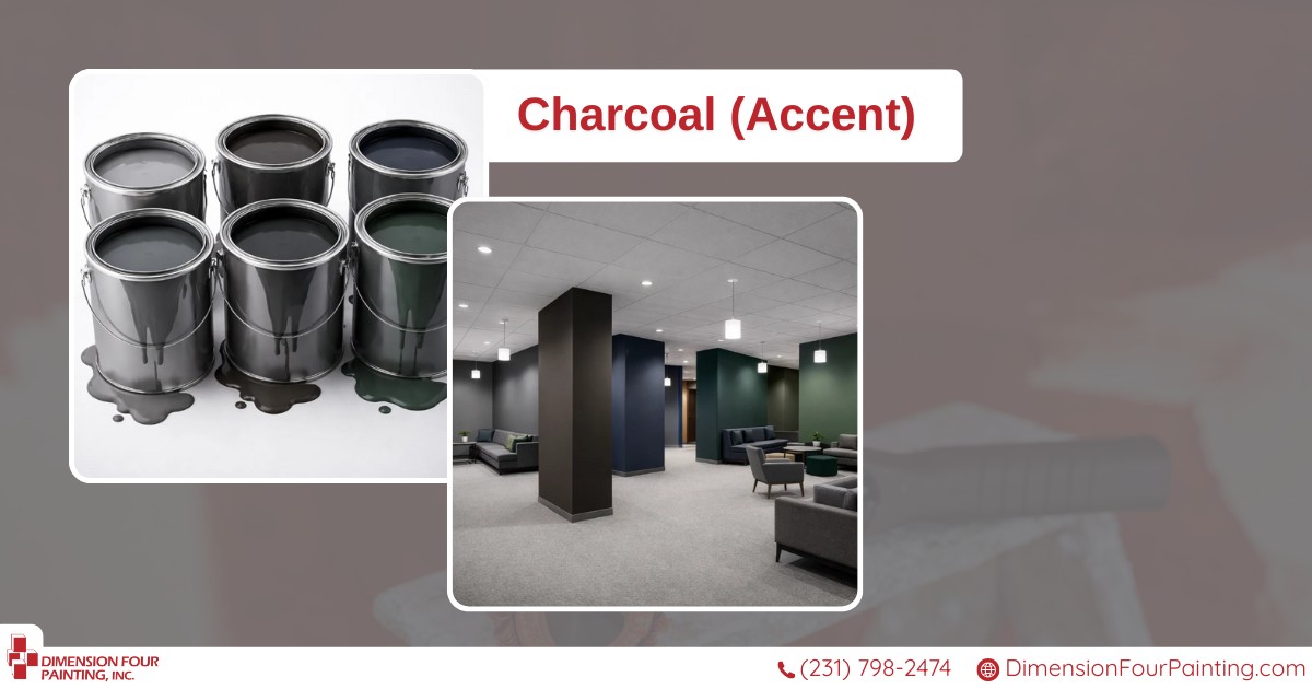
How to Choose the Right Color for Your Space
While trends provide direction, the best color choice depends on how the space is used. Consider how much natural light the area receives, how often the walls will be cleaned, and whether the space needs to feel calming, energizing, or neutral.
Commercial environments benefit from colors that are durable, easy to maintain, and versatile over time. A well-chosen palette should support your brand, not compete with it, and it should look just as good five years from now as it does in 2026.
Testing sample areas on actual walls is always recommended. Lighting, flooring, and surrounding finishes can significantly affect how a color reads in real-world conditions.
Learn more about painting your commercial properties here!
Final Thoughts: Color That Works as Hard as Your Business
The best interior colors for commercial spaces in 2026 aren’t about chasing trends; they’re about making smart, lasting choices. Neutral foundations paired with thoughtful accents create interiors that feel modern, comfortable, and professional without becoming dated.
When applied correctly, color supports productivity, improves customer experience, and strengthens brand perception across your facility.
If you’re planning an interior repaint and want help selecting colors that fit your space, your industry, and your long-term goals:
Ready to refresh your space with confidence?
📞 Call 231-798-2474 to discuss your project, or request your free, no-obligation commercial painting estimate online.
Let’s choose colors that make your business look its best, now and well into the future.